
CTA Button Guide: 7 Best Practices for Consistent Sales in 2026
Call-to-Action (CTA) button optimization requires high visual contrast, action-oriented microcopy, strategic above-the-fold placement, and mobile touch sizing in October 2026. Follow our tactical CRO blueprint to increase ecommerce and affiliate click-through conversion rates.
Featured visual highlights Call-to-Action button design best practices and conversion rate optimization (CRO) fundamentals for 2026.
A Call-to-Action (CTA) button is the primary visual element on a webpage that directs visitors to perform a specific conversion action. This includes purchasing a product, starting a free trial, or subscribing to an email newsletter.
CTA buttons serve as the critical bridge between reader engagement and revenue generation across digital marketing funnels.
Poorly designed CTA buttons with weak color contrast, vague button text, or improper mobile sizing create conversion friction. Visitors leave landing pages without taking action when visual cues remain ambiguous.
Implementing proven CTA button design standards increases click-through rates across landing pages and commercial review posts significantly.
Evaluating CTA button optimization requires analyzing color psychology, button copy verbs, white space isolation, and mobile touch targets.
Marketers optimizing landing pages can pair these techniques with recommendations from our best landing page builders guide.
Optimizing button placement and visual hierarchy turns passive readers into active buyers, maximizing return on website traffic investments.
7 Call-to-Action Button Best Practices Summary Matrix for 2026
Comparing CTA button design elements clarifies visual styling choices, copy formulas, and strategic placement guidelines. Review the summary matrix below to audit your CTA buttons against industry conversion benchmarks.
Evaluating button design rules ensures your landing page calls-to-action capture visitor focus effortlessly.
| CTA Design Factor | Optimal Specification | Conversion Impact |
|---|---|---|
| 1. Visual Contrast | High-contrast background colors (Orange #FF6B00 / Green #28A745) | Maximum visual salience |
| 2. Attention Elements | Directional icons, subtle drop shadows, and hover elevation | Signals interactive clickability |
| 3. Color Selection | Complementary pop colors with 4.5:1 text contrast ratio | WCAG compliance & instant notice |
| 4. Action Microcopy | First-person action phrases (“Claim My Free Trial Now”) | Increases click intent up to 90% |
| 5. Strategic Placement | Above the fold, mid-content, and post-conclusion summaries | Captures intent at decision peaks |
| 6. Mobile Touch Sizing | Minimum 48px height with 12px padding & full-width layout | Eliminates mobile touch errors |
| 7. A/B Testing | Single-variable split testing on microcopy, colors, and placement | Continuous compound revenue lift |
Detailed Breakdown: 7 CTA Button Best Practices for High Conversions
Applying structured design guidelines ensures your call-to-action buttons command reader attention across desktop and mobile browsers. Explore each best practice step below to optimize button performance.
Testing visual contrast and copy variations systematically isolates high-performing design elements across your sales funnel.
1. Ensure CTAs Buttons Are Visually Clear and Distinct
Clear CTA buttons utilize crisp rectangular borders, bold typography, and distinct background shading to separate buttons from surrounding content. Visitors must instantly recognize buttons as clickable interactive elements within 3 seconds of landing on a page.
Isolating buttons with generous white space padding prevents surrounding body text from overwhelming visual focus.
Using rectangular button shapes with subtle 4px rounded corners maintains professional editorial design standards.
Avoiding flat text links for primary conversion goals increases overall page click-through volume.
Ensuring clear visual distinction guides visitors naturally toward your primary conversion objectives.
Clear visual boundaries make buttons stand out against dense blog article paragraphs.
Marketers building dedicated sales pipelines can review funnel integration tactics in our sales funnel builders guide.
2. Design Attention-Grabbing CTA Visual Elements
Attention-grabbing CTAs incorporate subtle hover effects, drop shadows, and directional cues to draw reader eyes. Adding visual depth signals clickability to mobile and desktop web users.
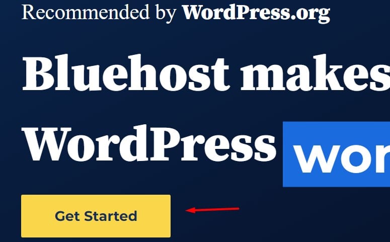
Visual attention cues like directional arrows and hover shadow animations highlight primary call-to-action buttons.
Utilizing drop shadows gives buttons physical elevation off the page background, creating a tactile affordance.
Incorporating small directional icon arrows next to button text increases user click motivation.
Maintaining design consistency across all site buttons builds familiar conversion patterns for returning readers.
Hover animation effects reassure desktop users that elements are fully interactive.
Subtle transition animations of 0.2 seconds provide instant visual feedback without degrading website performance.
3. Select High-Converting Colors for CTA Buttons
High-converting CTA button colors depend on page color harmony, utilizing complementary pop colors like bright orange or green. Orange (#FF6B00) and green (#28A745) consistently generate high conversion rates by contrasting against standard blue and gray website backgrounds.
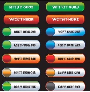
Color contrast wheel demonstrates selecting high-visibility CTA button colors against page background palettes.
Selecting button colors that contrast starkly against your website’s primary brand theme ensures immediate visual pop.
Ensuring white text font color maintains a 4.5:1 minimum contrast ratio against button background shading satisfies Web Content Accessibility Guidelines (WCAG).
Reserving your bright accent button color strictly for primary conversion CTAs prevents visual confusion.
Testing distinct color palettes ensures your calls-to-action stand out across dark and light website themes.
Using contrasting secondary buttons for secondary actions prevents split decision paralysis for potential buyers.
4. Use Action-Oriented Language and First-Person Copy
Action-oriented CTA microcopy replaces generic submit labels with specific action verbs describing user value. Phrasing button copy in the first-person perspective boosts click conversions by up to 90%.

Action-oriented CTA button microcopy examples emphasize immediate value delivery like Start 14-Day Free Trial.
Replacing passive words like Submit or Click Here with value phrases like Claim 30% Discount Now clarifies conversion benefits.
Adding urgency modifiers like Today or Now encourages immediate decision making before visitors leave the page.
Keeping button copy concise (3 to 5 words max) maintains clean button proportions across screen sizes.
First-person copy phrasing creates psychological ownership of the offer before the user even clicks.
Pairing active verbs with risk reducers like No Credit Card Required removes final hesitation at checkout.
5. Strategic Placement Above the Fold and Mid-Content
Strategic placement positions CTA buttons above the fold, at logical decision points, and immediately after product walkthroughs. Placing primary buttons where user intent peaks guarantees maximum click availability.
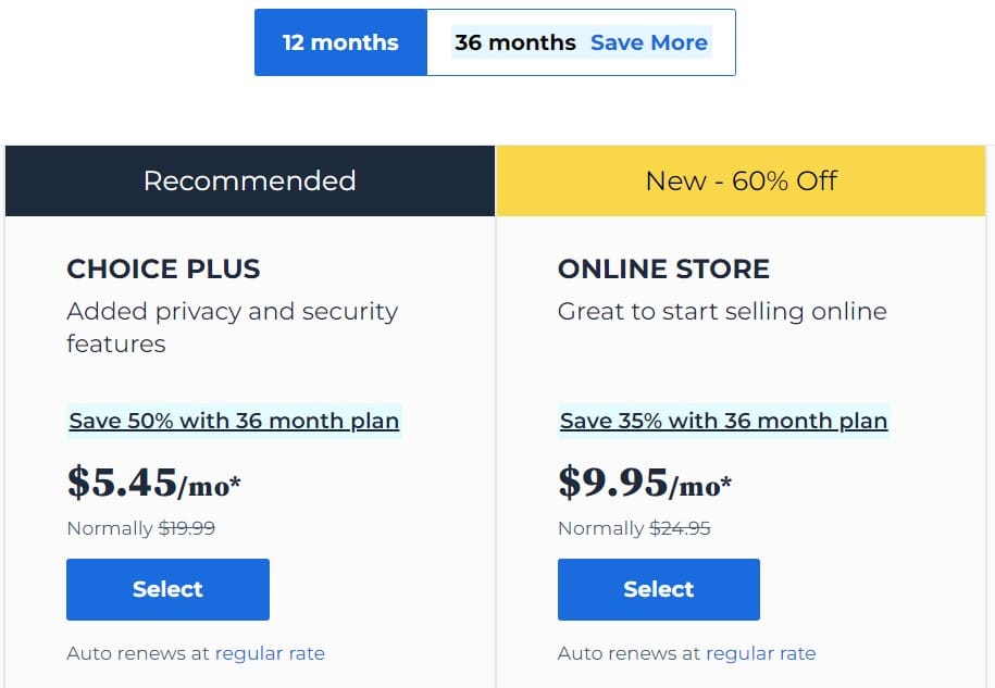
Strategic CTA placement map illustrates positioning buttons above the fold and following key benefit sections.
Placing an initial CTA button above the fold catches high-intent returning visitors without requiring scrolling.
Inserting mid-content CTA buttons right after pricing tables or pros and cons lists captures educated buyers.
Concluding long-form articles with a final summary CTA box captures readers who finish reading the full post.
Positioning calls-to-action adjacent to positive testimonial quotes boosts buyer confidence.
Store owners optimizing product funnels can explore our guide on converting visitors into sales.
6. Ensure Mobile-Friendly Touch Target Sizing
Mobile-friendly CTA buttons require minimum touch target dimensions of 48px height with ample padding to accommodate thumb taps. Small or tightly packed buttons cause accidental misclicks on smartphone screens, frustrating mobile visitors.
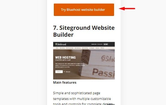
Mobile responsive button layout preview shows full-width button styling for seamless touchscreen interaction.
Utilizing full-width button styling on mobile viewports makes button tapping effortless on smartphones.
Maintaining at least 16px vertical spacing between adjacent buttons prevents accidental wrong-link clicks.
Testing button rendering across iOS Safari and Android Chrome confirms smooth touchscreen performance.
Ensuring generous touch padding allows mobile shoppers to click buttons comfortably with one hand.
Centering mobile buttons within easy thumb reach reduces screen stretching on larger smartphones.
7. Execute Continuous A/B Testing & Click Optimization
A/B split testing compares two CTA button variants to identify high-converting designs. Testing one variable at a time ensures accurate attribution of conversion rate improvements.
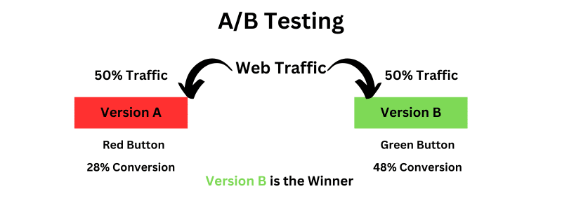
A/B split testing analytics dashboard tracks conversion rate performance variations between CTA button designs.
Test button copy variations first, as microcopy phrasing often drives larger conversion lifts than color tweaks alone.
Allow split tests to collect statistically significant sample sizes before declaring winning variants.
Implementing winning split test configurations permanently increases long-term website revenue performance.
Tracking click-through analytics continuously identifies decaying buttons that require design refreshes.
Documenting test results creates an empirical conversion benchmark database for future marketing campaigns.
Frequently Asked Questions About Call-to-Action Buttons
Frequently asked questions resolve common user queries regarding CTA button colors, copy formulas, and placement rules. Read detailed answers below to refine your conversion rate strategy.
What is the highest converting color for CTA buttons?
There is no single universal winning color, but bright pop colors like Orange (#FF6B00) and Green (#28A745) consistently rank highest. The winning color is whichever hue creates the strongest visual contrast against your site background.
Avoid using your primary background or text color for CTA buttons, as low contrast causes buttons to blend in unnoticed.
Testing bright accent colors ensures your call-to-action commands immediate visual attention.
Where is the best place to put a CTA button on a blog post?
The best places for CTA buttons in blog posts are above the fold, immediately following pricing tables, and at the post conclusion. Placing buttons where reader interest peaks maximizes click-through opportunity.
Including multiple strategically placed CTAs throughout long-form content serves readers at different decision stages.
Placing call-to-action buttons near key visual evidence images increases overall conversion rates.
What size should a CTA button be on mobile devices?
Mobile CTA buttons should measure at least 48 pixels in height with 12 to 16 pixels of vertical padding to fit average thumb sizes. Designing buttons with full-width layouts ensures comfortable one-handed taps on touchscreen smartphones.
Adhering to standard touch dimensions eliminates frustrating misclicks and boosts mobile form completion rates.
How many CTA buttons should you include per page?
Include one primary call-to-action goal per page, repeated strategically three to five times across long-form content. Presenting competing conversion goals creates decision paralysis, while repeating the same primary CTA reinforces user intent.
Consolidating focus around a single desired action maximizes landing page conversion efficiency.
Should CTA button copy use first-person or second-person voice?
First-person phrasing like “Start My Free Trial” generally converts higher than second-person phrases like “Start Your Free Trial.” First-person copy creates psychological ownership, motivating visitors to complete their conversion journey.
Testing both perspectives on your target audience validates which voice resonates most effectively.

I’m Abdullah Prem, a passionate blogger with over 10 years of experience. I created BloggersNeed to produce high-quality, easy-to-understand articles, guides, and tutorials that help people start their blogging journey. Specializing in WordPress, Hosting, Themes, and online money-making strategies, I’ve been featured on leading tech platforms such as Tech.co, Cloudways, Business2Community, Leadpages, GoodFirms, and ShareThis. BloggersNeed.com