
Here is the article about Perfect Lead Generating Website Design with examples for lead generation online business.
What’s the one thing that can skyrocket a freelancer’s motivation level, you might ask?
Getting new clients.
You know what I’m talking about, don’t you?
As freelancers, when you’re negotiating with the client and closing new deals, it just feels like a massive win.
That’s to be expected, of course. After all, when you think about the $$$$ that comes with the deal that you closed and what it means for your family’s sustenance, you can’t help but be excited.
In this guide, we’re going to look into the elements that you need to incorporate into your website as a freelancer, so you can get more clients and projects.
If you have a website (and traffic) but you’re getting very little to no clients out of it, then this guide is for you.
Let’s hop right in.
Perfect Lead Generating Website Design
1. A Cleverly-crafted FAQ or Resource Page
Your FAQ or Resource pages can do wonders for you when it comes to winning more clients.
Your FAQs should address your customers’ most glaring questions. As you answer their questions, be strategic in how you pitch your services or add your CTAs.
When you mention your service as a solution to their problem, it’ll be easier for them to consider hiring you.
This method is far more effective when compared to you pitching your services without any context.
In essence, the content in your FAQ or Resource page is what you need to pitch strategically.
Let’s say you’re a web developer and your primary customers are dropshippers. In your resource page, you can create a comprehensive guide on “Everything You Need to Know About Dropshipping” just like Oberlo did.
Notice how in their page, they have several easy-to-find CTAs that their web visitors can take action on, which would ultimately turn them into leads or paying customers?
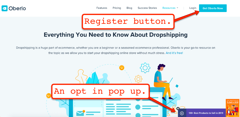
In Oberlo’s page, there are truckloads of content that helps their audience learn more about dropshipping. And within each page, there is always a CTA that their audience can use to sign up to their email list or straight up get Oberlo.
If your guide gives TONS of value to your readers, it’ll be easier for them to open up to you.
And when they have problems or they get stuck, you’ll be their go-to person.
Can you see how powerful your FAQ or resource pages can be for your freelancing business? Not only can both pages help you with getting more traffic, building relationships, and winning your would-be customers’ trust, it can be a money-making machine.
2. Keyword Optimized For Better Quality (and relevant) Traffic
If you want to get traffic and leads from the search engines, then you need to keyword optimize your website.
To make sure that you’re targeting the right keywords for your website, you can use an online tool like Ubersuggest.
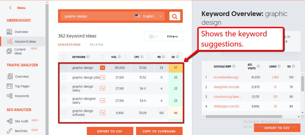
For example, if you offer graphic design services, you can type it in the search box and the tool will give you several keyword suggestions, their monthly average search volume, cost per click, paid difficulty, and SEO difficulty.
The tool also offers other features such as checking the backlinks to your website. This tells you how many and which websites hyperlink to your site.
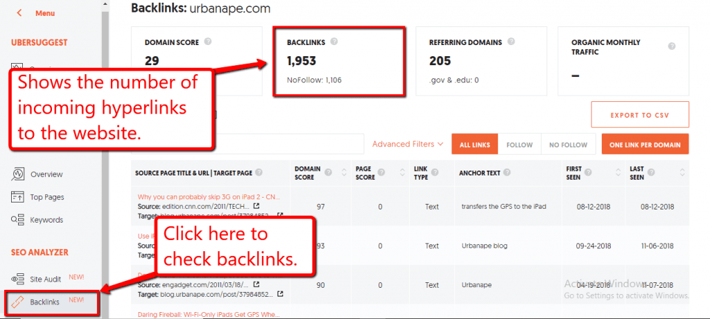
The data you can obtain from the tool can help you decide if the keywords you’re thinking of targeting is a feasible prospect or not.
It also helps you uncover other keywords that you might have missed, and even help you come up with topics for your website’s content.
3. Easy-to-use Contact Form
Contact forms are important because most of your web traffic are most likely using mobile devices.
And when you’re using a smartphone, it’s going to take several steps to reach out to a website owner through email when compared to using a form.
Your customers would have to copy and paste your email, go to their email app, paste your email, etc…
When using a contact form, however, they just need to type in their name, email, and message — that’s about it.
So you can create a professional looking contact form, you can integrate tools like Wufoo into your freelancer website.
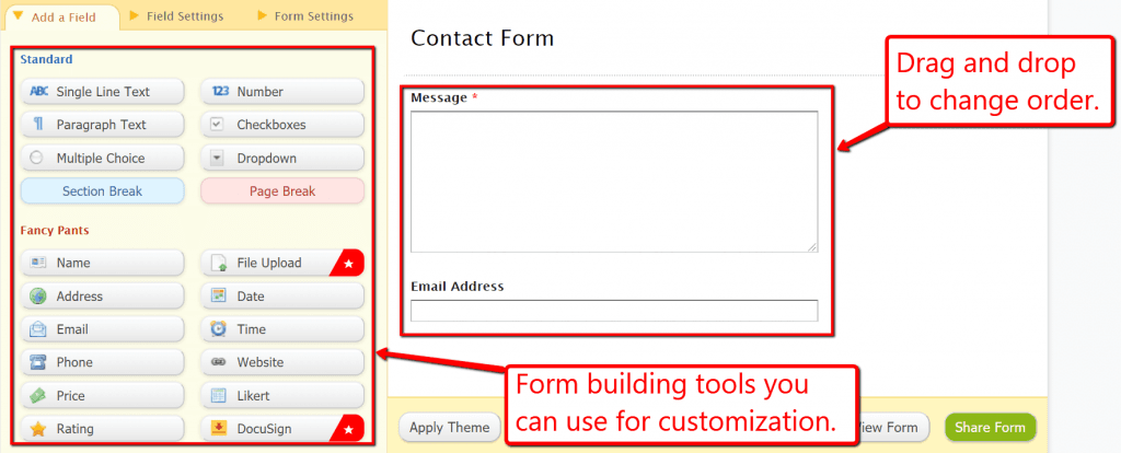
The tool offers form building functions to customize your contact form according to your liking, such as adding or removing fields, dropdowns, email address, and more.
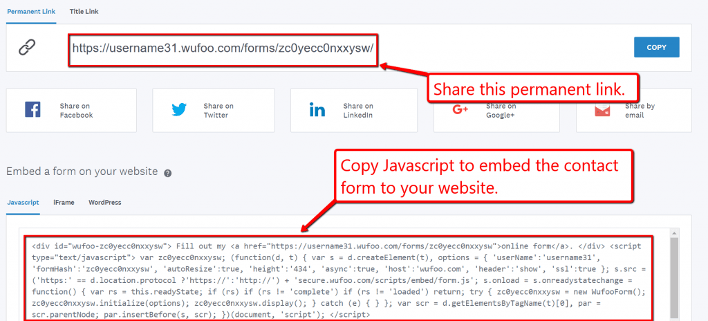
Once you’re done building your contact form, you can share the permalink on your social media accounts or embed it to your website by copying the Javascript code snippet and pasting it directly to your webpage HTML.
With all that said, adding contact forms is a great way to build a relationship with your potential clients, and that relationship can be a factor to help them decide whether or not to work with you.
4. Testimonials and Social Proof
Adding testimonials and positive reviews on your website can help push your interested (yet hesitant) website traffic into clicking your “Contact Me” buttons.
When your web traffic sees that you have several happy customers, it will give them a level of comfort and assurance that you are a reliable freelancer to work with.
Sometimes, that’s really all it takes.
The good news is, it’s easy to include social proof and testimonials on your freelancer website.
If you have raving reviews from freelancing websites that you’ve worked from, you can ask permission from previous clients to post their reviews on your site.
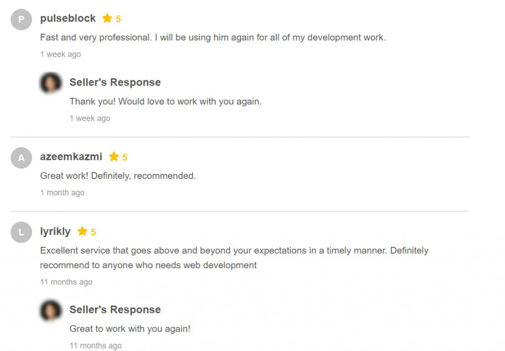
Keep in mind that reviews and referrals can have a significant influence on people, and can be as good as someone attesting to the reliability and excellent quality of your services.
Displaying testimonials like these on your website can help get more people to trust in your work and convince them to hire you.
5. High-converting Service Page
Your service page is crucial because it tells your would-be clients if you’re offering the type of service that they’re looking for.
Once that has been established, your prospective client would then continue looking into your website for more information.
That is why, as a freelancer, you need to make sure that your website’s service page is high-converting.
That it has all the bells and whistles it needs to compel your audience to take action on your offers.
Here are a few tips to help you create a service page that can get you more clients:
Position your offers strategically. Don’t just add your rates blindly. Package them so your products would have a higher perceived value.
Add compelling copy: Instead of highlighting how awesome your product is, focus on how your customers can benefit from them instead. Remember your customers are almost always asking the question, “What’s in it for me?” Talking about the benefits will address that question.
Focus on one feature: You need to know what your audiences’ burning issues are and address them in your service page. Highlight the one product or service that can help them with their most pressing issues.
Choose one centerpiece only: Adding too many will just confuse your audience and dilute the convincing power of your service page.
Lead Generating Website Design: Conclusion
If you are dead serious about growing your career as a freelancer, you need to invest in a website — one that can get really help you win clients.
The tips above can make that happen. Take action on those tips, and you’ll be able to convert your website traffic into paying clients.
What’s next?
Having a website is great, however, you need to leverage the value that freelance marketplaces can get you when it comes to getting clients.
Freelance marketplaces can be a treasure trove for freelancers who are looking for clients. Here in Freelancermap, alone, there are hundreds of job opportunities.
Affiliate Disclosure: Some of the links in this post are affiliate links, which means I may earn a small commission if you make a purchase through those links. This comes at no extra cost to you. Thank you for your support!
