
Shopify banner size specifications require hero image dimensions of 1920 x 1080 pixels (16:9 aspect ratio) for desktop displays and 800 x 1000 pixels (4:5 aspect ratio) for mobile smartphones. Adhering to these standard dimensions ensures razor-sharp visual clarity without layout distortion across modern screens.
Compressing hero images below 250 kilobytes accelerates storefront page speed and prevents Largest Contentful Paint delays on mobile network connections.
When customizing storefront layouts, selecting from the best Shopify eCommerce themes provides pre-configured responsive image containers that adapt banner graphics seamlessly across all device viewports.
Shopify Banner Dimensions by Store Section
Different storefront placements demand tailored pixel dimensions to accommodate unique aspect ratios, header heights, and interactive elements. Matching banner dimensions to specific theme layout containers prevents awkward horizontal stretching and blurry upscaling on high-DPI Retina screens.
Online store owners should configure distinct banner assets according to each storefront zone to ensure consistent brand presentation.
| Banner Placement Section | Recommended Desktop Dimensions | Recommended Mobile Dimensions | Target File Size | Optimal File Format |
|---|---|---|---|---|
| Main Hero Banner / Slider | 1920 x 1080 px (16:9) | 800 x 1000 px (4:5) | Under 250 KB | WebP / Progressive JPG |
| Collection Page Header Banner | 1800 x 400 px (9:2) | 800 x 400 px (2:1) | Under 150 KB | WebP / JPG |
| Split Image / Grid Banner | 1000 x 1000 px (1:1) | 600 x 600 px (1:1) | Under 120 KB | WebP / PNG |
| Promotional Announcement Bar | 1920 x 60 px | 800 x 60 px | Under 30 KB | SVG / WebP |
| Full-Width Video Background | 1920 x 1080 px | 1080 x 1920 px (9:16) | Under 3 MB | MP4 / WebM |
Implementing section-specific dimensions ensures that product photography remains focal while promotional text stays completely legible.
Desktop vs Mobile Aspect Ratios and Safe Zones
Balancing horizontal desktop displays with vertical mobile screens requires establishing a central visual safe zone where crucial text and product imagery remain visible. Because Shopify themes dynamically crop image boundaries to fill variable screen heights, positioning text at the periphery causes severe clipping.
Applying the 60 percent rule keeps essential visual information centered so automated responsive cropping trims only background textures.
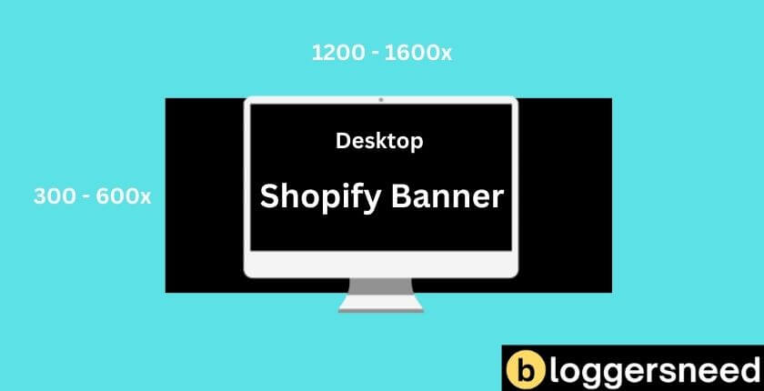
Understanding the Desktop 16:9 Widescreen Ratio
The standard 16:9 widescreen ratio (1920 x 1080 pixels) provides an expansive canvas that fills modern desktop monitors and laptops without black letterboxing. This format allows sufficient horizontal space to place lifestyle photography on one flank and headline typography on the other.
Webmasters using alternative platforms can explore our comparative guide on ecommerce themes WordPress to contrast banner container architecture across CMS ecosystems.
Designing for Mobile 4:5 Vertical Viewports
Mobile shoppers represent over 70 percent of eCommerce traffic, making dedicated 4:5 vertical banners (800 x 1000 pixels) critical for conversion rates. A horizontal desktop image scaled down to mobile becomes an unreadable narrow sliver, forcing shoppers to squint.
Configuring theme sections that accept independent mobile image uploads allows you to serve purpose-built vertical imagery that commands the entire smartphone display.
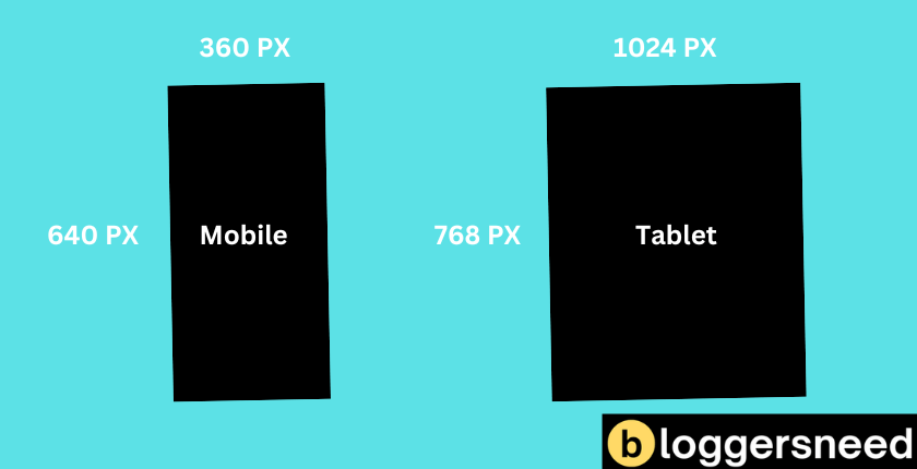
Image Compression and Core Web Vitals Optimization
Compressing Shopify banner images directly improves Google Core Web Vitals metrics, specifically Largest Contentful Paint (LCP) and Cumulative Layout Shift (CLS). Large uncompressed image files slow down page rendering, causing mobile bounce rates to rise dramatically.
Shopify automatically serves modern image formats through its global content delivery network, but pre-optimizing source files remains essential.
Adopting Modern WebP and AVIF Formats
WebP and AVIF compression algorithms provide superior lossy and lossless compression, delivering 25 to 35 percent smaller file sizes than traditional JPEG. Smaller file footprints ensure hero banners render in under one second on standard 4G mobile connections.
Modern design applications like Photoshop and Figma allow direct WebP exporting with custom quality thresholds to preserve edge sharpness.
Eliminating Cumulative Layout Shift (CLS)
Cumulative Layout Shift occurs when banner images load without pre-defined aspect ratio placeholders, pushing product catalogs down the page. Specifying explicit width and height attributes in your theme Liquid templates reserves space before the visual asset finishes downloading.
Preventing sudden layout jumps improves user trust and ensures compliance with Google page experience ranking signals.
Best Practices for High-Converting Shopify Banners
High-converting Shopify banners combine concise promotional copy, high-contrast action triggers, and lifestyle photography that reinforces product utility. Strategic banner execution guides first-time visitors into curated collection pages and seasonal discount campaigns.
The essential design rules for Shopify storefront banners focus on readability and performance across diverse consumer devices.
Establishing High Visual Contrast for Typography
Text layered over busy lifestyle photography often becomes unreadable unless protected by semi-transparent color overlays or subtle text drop shadows. Applying a 20 percent dark gradient behind white headlines ensures crisp readability across varying screen brightness settings.
Reviewing our comprehensive checklist on how to convert visitors traffic into sales eCommerce helps refine headline messaging for maximum purchase intent.
Designing Touch-Friendly Call-to-Action Buttons
Call-to-action buttons embedded within Shopify banners must meet minimum mobile tap target requirements of at least 48 by 48 pixels. Placing buttons prominently within thumb-reach zones prevents miss-clicks and streamlines navigation into product catalogs.
Studying our practitioner analysis of cta button best practices reveals how button color psychology and microcopy influence click-through rates.
Shopify Theme-Specific Banner Recommendations
Different Shopify theme frameworks apply proprietary CSS scaling rules that influence how hero banners crop on dynamic viewports. Reviewing theme-specific documentation prevents unexpected cropping issues across free and premium themes.
Every commercial theme engine processes image containers through distinct styling logic, requiring slight dimensional adjustments.
Dawn Theme Default Image Banner Scaling
The default Shopify Dawn theme utilizes responsive container heights that automatically adjust banner images based on first image adaptation settings. Setting banner height to adapt to first image prevents unwanted vertical cropping on desktop displays.
Configuring desktop content position to middle center guarantees that promotional messages stay anchored regardless of browser window scaling.
Prestige and Impact Theme Luxury Scaling
Premium luxury themes like Prestige and Impact feature full-bleed hero viewports designed to showcase high-resolution editorial photography. Uploading 2400 by 1200 pixel imagery preserves visual crispness on 4K resolution displays without slowing down initial page render times.
Utilizing subtle parallax scroll effects creates immersive shopping experiences that strengthen perceived brand authority among high-ticket buyers.
Banner Typography and Web Accessibility Standards
Storefront banner typography must satisfy WCAG 2.1 accessibility standards to ensure legible readability for visually impaired shoppers. Designing banners with compliant contrast ratios expands commercial audience reach while avoiding legal compliance liabilities.
Search engines favor accessible storefronts that implement descriptive alt text and clean typographic hierarchies.
Color Contrast Ratios and Overlay Opacity
Maintaining a 4.5 to 1 contrast ratio between typography and banner background ensures effortless reading across varying lighting environments. Adding a semi-transparent dark CSS overlay behind white text shields headlines from color shifts in underlying photos.
Webmasters should avoid hardcoding marketing text directly into flat raster image files where screen readers cannot parse the promotional content.
Responsive Font Scaling and Text Containers
Responsive font sizing ensures headline copy remains proportionate across handheld smartphones, tablets, and widescreen desktop monitors. Modern Shopify 2.0 theme settings allow independent mobile typography adjustments to prevent oversized headings from obscuring hero products.
Testing banner rendering across physical mobile hardware verifies that text lines wrap naturally without splitting brand names awkwardly.
Frequently Asked Questions About Shopify Banner Sizes
Frequently asked questions resolve common store owner challenges regarding dimension standards, blurriness troubleshooting, and multi-device cropping rules. Reviewing these answers ensures your storefront visual assets maintain high conversion performance.
What is the best overall banner size for Shopify?
The recommended overall desktop hero banner size for Shopify is 1920 by 1080 pixels with a 16:9 aspect ratio. For mobile screens, the ideal banner size is 800 by 1000 pixels with a 4:5 portrait ratio to fill vertical smartphone viewports without unwanted side cropping.
Why is my Shopify banner blurry on desktop screens?
Shopify banners appear blurry when uploaded at low resolutions below 1920 pixels wide, causing high-DPI Retina displays to artificially upscale pixel data. Exporting banners at 72 DPI with exact 1920-pixel widths ensures sharp visual rendering without pixelation artifacts.
How do I prevent my Shopify banner from cropping on mobile devices?
You prevent mobile banner cropping by keeping all critical headline text and brand elements inside the central 800 by 800 pixel safe zone. Utilizing modern Shopify 2.0 themes with separate desktop and mobile image upload fields guarantees pixel-perfect mobile rendering.
What is the best image format for Shopify banners?
WebP is the best image format for Shopify banners because it reduces file sizes by up to 30% compared to traditional JPEG and PNG files without sacrificing image clarity. Smaller file sizes accelerate Largest Contentful Paint scores across mobile devices.
What is the maximum file size for a Shopify hero banner?
The maximum recommended file size for a Shopify hero banner is under 250 kilobytes to preserve Core Web Vitals performance. Compressing visual assets before uploading prevents mobile layout shifts and reduces page load times below 2 seconds.

I’m Abdullah Prem, a passionate blogger with over 10 years of experience. I created BloggersNeed to produce high-quality, easy-to-understand articles, guides, and tutorials that help people start their blogging journey. Specializing in WordPress, Hosting, Themes, and online money-making strategies, I’ve been featured on leading tech platforms such as Tech.co, Cloudways, Business2Community, Leadpages, GoodFirms, and ShareThis. BloggersNeed.com